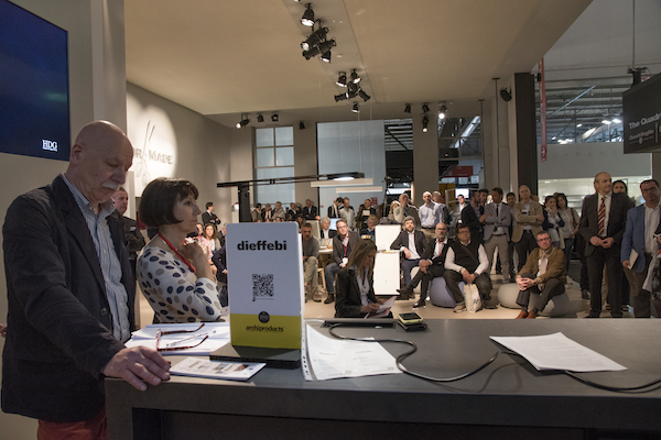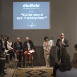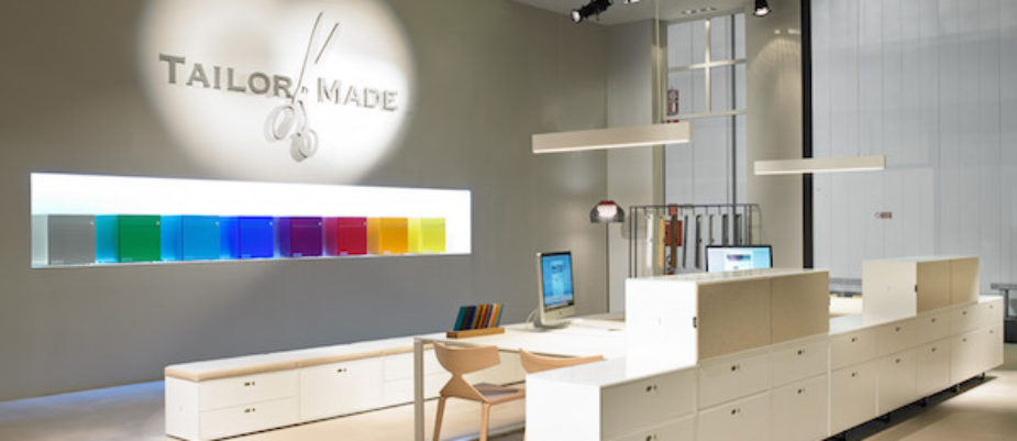
The question was answered by guest experts: Lia Luzzatto, Aldo Bottoli and Claudia Salomoni invited to the seminar organized by Dieffebi on its Salone Ufficio stand. The company counts on the importance of perception of color and texture to approach customers’ needs by offering “tailor-made” customized products and made important investments in an innovative painting system which now makes it possible to provide maximum customization while keeping prices in line with the market.
“Colour is an important element that can help us work better and make a contribution to motivating people” underlines Alberto De Zan, Chairman of Dieffebi. Colour is not just a “cosmetic” but an innovation driver; underlying this “superficial” element there are visions and strategies with which to face the economic downturn and be more competitive.
What role does colour play in the Workplace?
Introduced at the end of the 60s by Quickborner Team, after years of colourless offices – grey and beige- thanks to the projects by Landscape Office, research into colour entered the work place for the first time as a humanising element, mainly through vivacious, rather naïf, blobs of colour. As Renata Sias pointed out when opening the seminar, awareness of the importance of a colour scheme and widespread sensitivity on the part of users are recent evolutions which nowadays induce us to make a more professional analysis of the complexity behind colour.
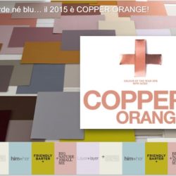
Are there fashionable colours also for the office?
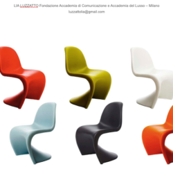
Lia Luzzatto, teacher and colour consultant starts her talk by quoting Danish designer Verner Panton “We sit more comfortably on a colour we like.” A statement that shifts the accent from shape to colour and highlights the intimate link between shades of colour and personal inclination.
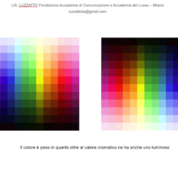
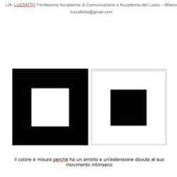
The value of colour is luminous as well as chromatic, and it creates the effect of perceptive illusion: for example dark colours squash the lighter ones (and so a ceiling that’s too high can be “adjusted” with a dark colour) whereas light colours tend to expand space.
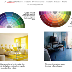
Colour also influences perceived temperature (so it’s better to use cold colours in south-facing rooms). Taste in the office certainly follows fashion, although it does not react to trends as quickly as dwellings.
In workplaces and public spaces the effect of colour on the activities performed in those areas is the most important factor to create lively atmospheres that inspires communication.
Lia Luzzatto concludes with a tip that goes beyond today’s trends: always assess how individual colours act on humans and choose at least one dominating shade.
Which is the right colour to use in the office?
Aldo Bottoli, perception designer, has a different approach. The right color is the natural one. The designer must try to reproduce in an artificial environment the conditions found in nature. And in nature colour is never ONE colour, but always MANY colours together. This creates complexity and neuroscience can provide the key to understanding how to restore the equilibrium of nature to constructed environments.
To create wellbeing and work well in the office we must bear many parameters in mind because in nature perception never involves just one sense. Our five senses – actually 16 have been identified – work together and every interior décor project must consider this synaesthesia.
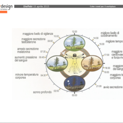
Our circadian rhythm changes vital parameters through the day – heart frequency, production of cortisol, melatonin, etc – and light is the prime source of information. Therefore, we mustn’t imagine we can create wellbeing just by thinking about shape or colour, because all our vital parameters must be coherent and harmonious.
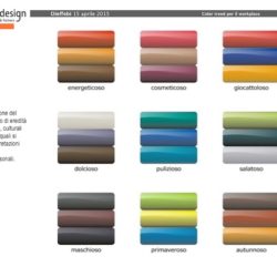
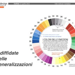
Our experience leads us to assess colours by comparison, because the brain makes a comparison and acquires information: we can say that there are “toyful” colours, others that are “cosmeticful”, “energyful”, “sweetful” and so on. However, we are talking about trends, not precise rules. Every human being associates colour with a personal meaning based on their experience.
Bottoli’s finaI advice is an invitation to think about humans’ double natures: an ancient biological one and a contemporary cultural one. And so, say no to generalizations when planning artificial environments. Perhaps it’s better to find balance in the needs of our 140,000 year-old human nature and start our project there.
Which are the colours’ performances?
In-depth analysis of the technical aspects of colour and the high performance a “superficial” coating can achieve is the task of Claudia Salomoni, Specification Advisor & Marketing Coordinator for Akzo Nobel, a multi-national leader in the production of powder coating, Dieffebi supplier and co-organizer of the seminar.( see the article).
