Tranquil Dawn is the Color of the Year 2020 by AkzoNobel, a color capable of infusing “Human Touch” into our living spaces.
As every year, the international team of color experts, designers and architects has analyzed emerging socio-economic worldwide trends translating them into chromatic trends: Colour Futures, a useful tool for architects and interior designers that suggests palettes in line with the sentiment of the year.
In 2020, light and clarity are needed more than ever, as we look to new horizons and ask ourselves, what does it mean to be human?
People are keen to examine their values and bring new meaning to everyday existence. In an increasingly digitized, superficial world, our global trend research suggests that people are experiencing a desire for positive real-world connections and relationships.
We want to take care of ourselves, of each other and the natural world, to learn about our heritage and rediscover lost skills.
We feel the need to make room in our lives for joyful and unexpected experiences, for awe and wonder.
We are looking for a place where we can contemplate our future, consider our purpose in this brave new world. Where we can better connect with our friends and family, our surroundings, with nature. Where we can express ourselves, be ourselves. We are looking to give our homes.
“The human touch”.
“We discovered the underlying question of 2020 was: what makes us human?
The theme “the human touch” arises in answer to that essential question. Tranquil DawnT is reminiscent of the colours of the morning sky and encapsulates our desire to treasure our most human qualities, which we’ll need in the new decade we are entering. Our trend research shows that people want to care, be playful, search for meaning, and be creative.” Heleen Van Gent, Creative Director Global Aesthetic Center, quoted.
‘The human touch’ looked to the soft, fluid colours and tranquillity of the morning sky for inspiration.
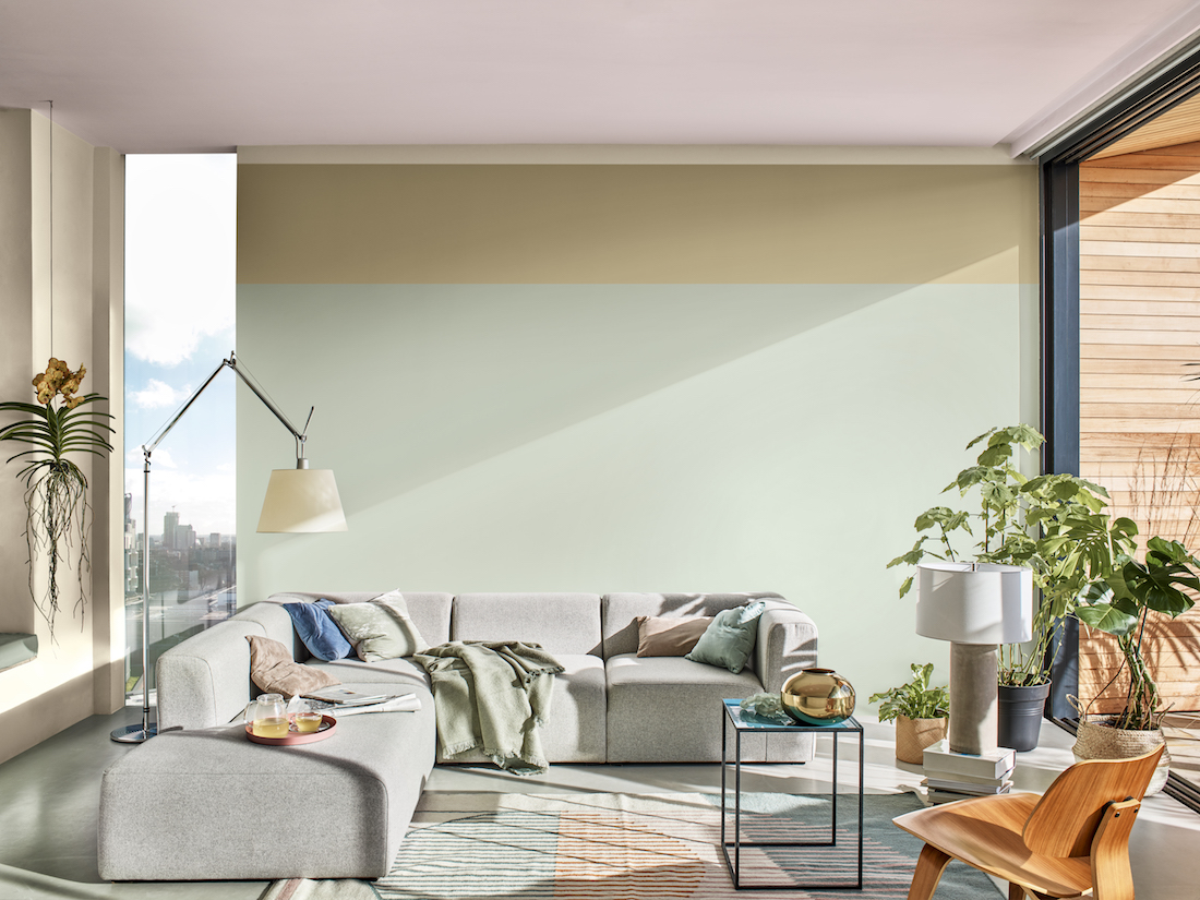
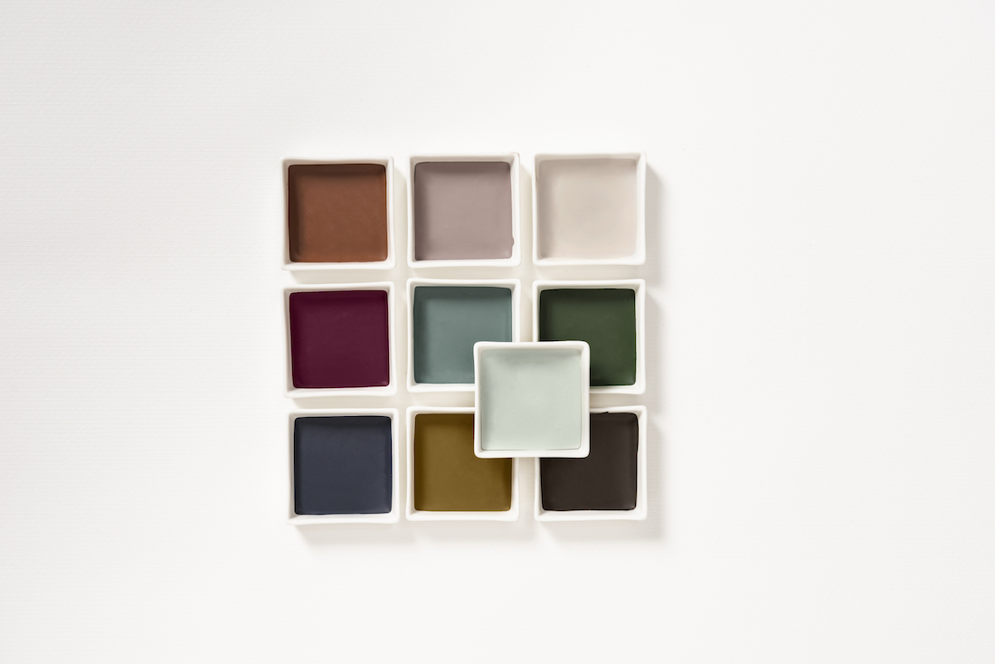
Tranquil Dawn has an air of calm and clarity that perfectly reflects our theme. Inspired by the dawn horizon, it is a delicate, fluid shade that sits somewhere between green, grey and blue.
Its effect changes depending on the colours it is used with, making it a beautiful versatile shade that gives interior design ‘The human touch’.
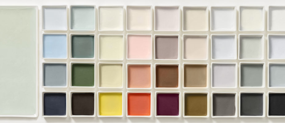
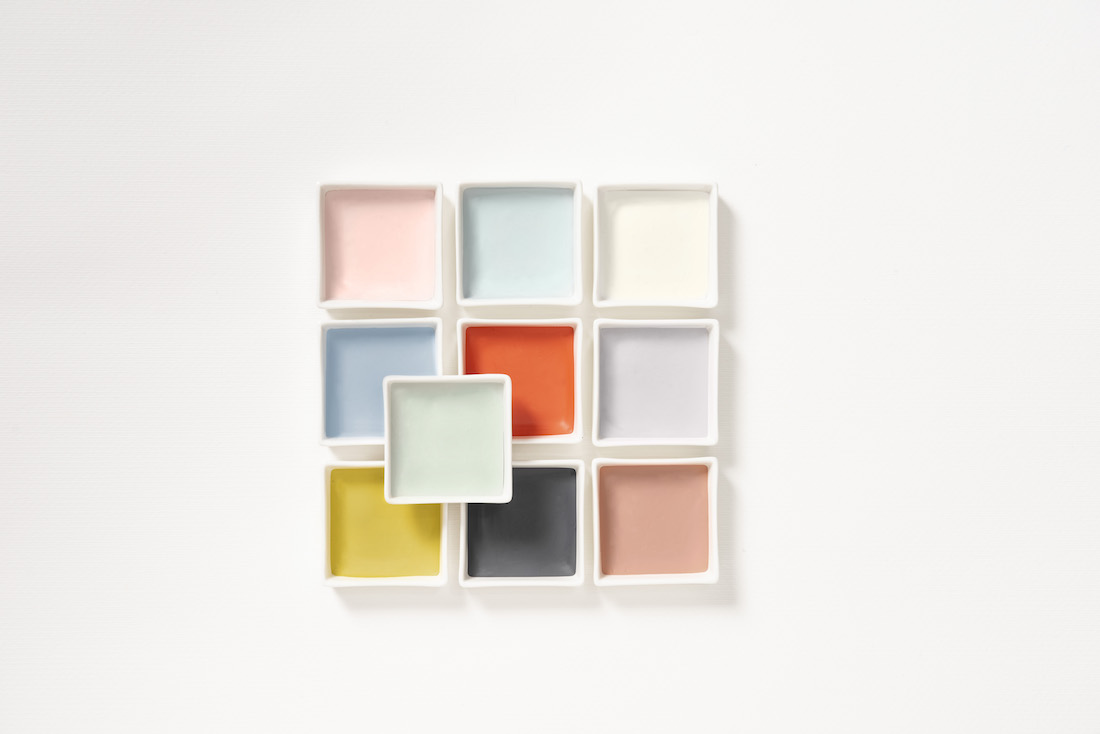
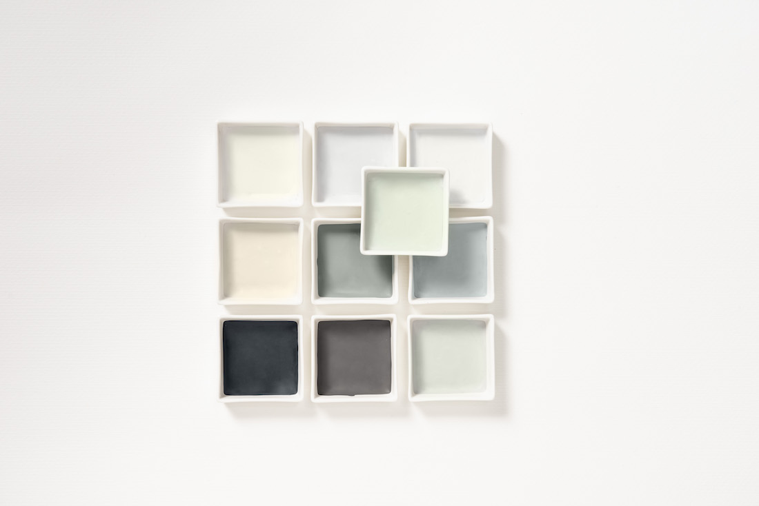
Those desires form the basis for all colour palettes in which Tranquil Dawn features, but to different effect: the palettes Care, Play, Meaning, Creativity are inspired by the soft tones of the morning sky in the different seasons.


Care, trend #1
People want to care. Modern life and our increasing reliance on technology and social media means we feel disconnected from the things that matter. There is a growing desire to make real, meaningful connections – with people, with nature, with our cities – and to ask, what can we contribute to society?
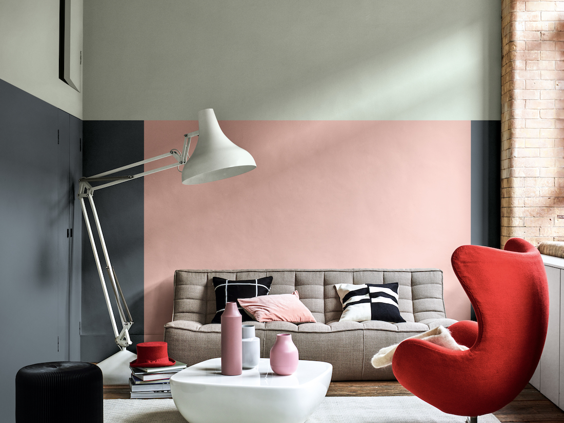
The Care palette
This soothing palette, which conjures up the colours of a crisp spring morning, helps breathe life into domestic spaces. Drawing nature into the home, the airy pastels create a caring environment, allowing us to be better humans.
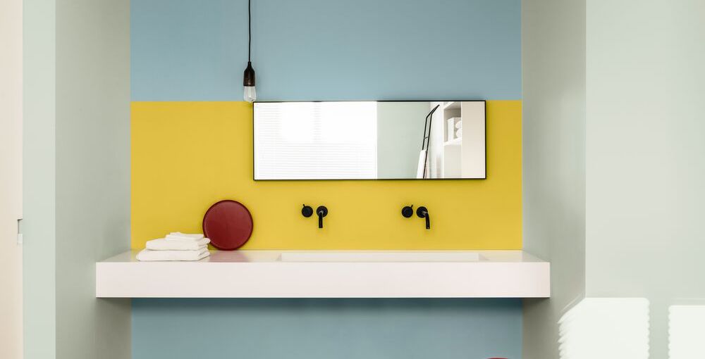
Playful, trend #2
People want to be playful. As we increasingly live our lives through the prism of social media, there’s a growing desire to make room for joyful moments and unexpected experiences – to find delight in the real world. This means valuing the imagination, and being open and receptive to finding new ways of challenging outdated thinking.
This Joyful palette
It can be used to create an energising space that fires the imagination and challenges ways of thinking. Disruptive and playful, it delights the senses and encourages a child-like appreciation of life.
Meaning, trend #3
People are seeking meaning. Our trend analysts have observed that, in this busy, digitalised world which can feel superficial, we lack depth and meaning.
The rapid advancement of technology is making us question our purpose, and with lives lived against a background of constant clamour – both real and digital –it can be hard to feel still, to experience awe.
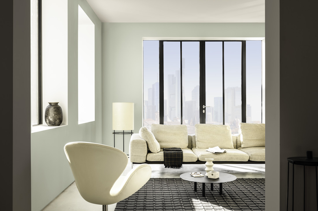
The Meaning palette
This minimalist palette, reminiscent of a remote chapel or monastery, can be used to create an atmosphere of contemplation and calm. Its elemental tones allow people to channel their energies and put their thoughts into perspective.
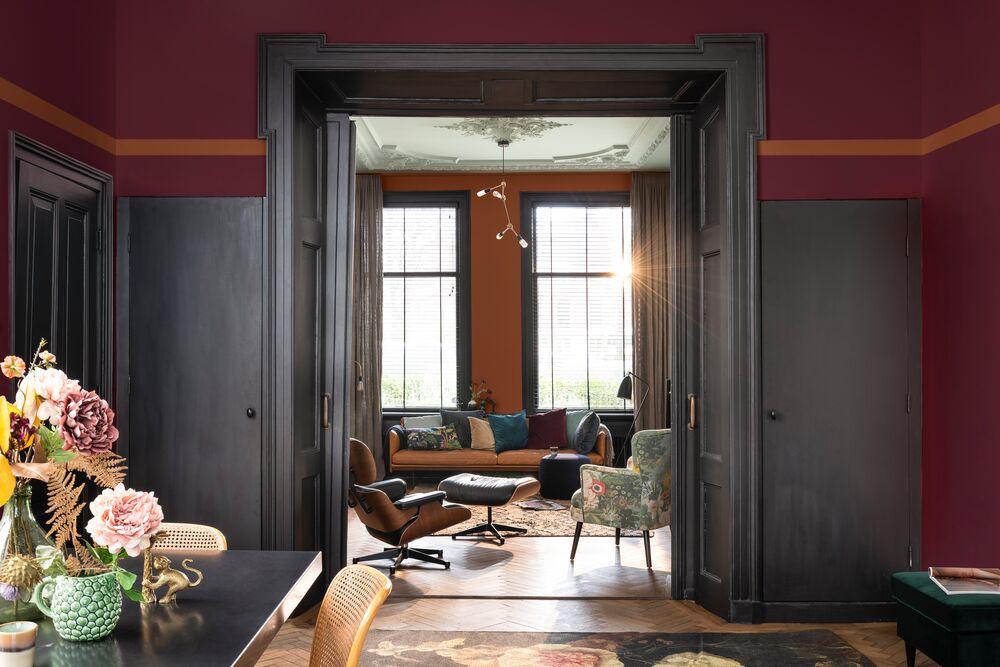
Creativity, trend #4
People want to be creative. With the rise of globalisation, mechanisation and technology, there is a realisation that we are losing the skills of our ancestors.
Our capacity for creativity has been diminishing as ever more sophisticated virtual realities loosen our tethers to the real world.
It feels like the right time to ask the fundamental question: what makes us special and different from robots?
The Creativity palette
This rich, sumptuous palette provides a space for self-expression and storytelling. A modern take on heritage colours, it can be used to help consumers cherish the skills of the past while exploring new ways of doing things.