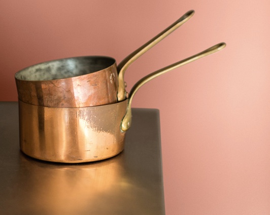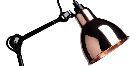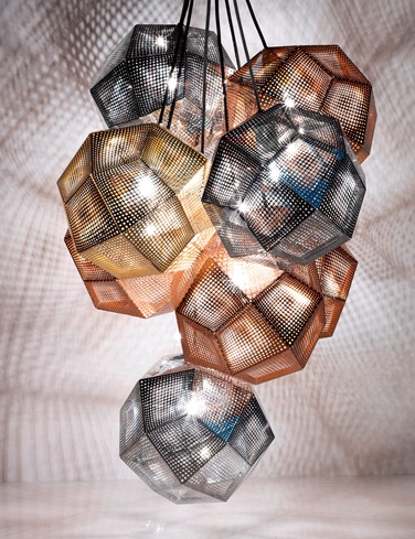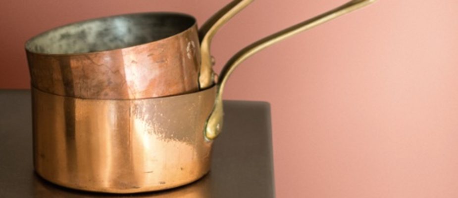
We had already detected a renewed interest in metals at the last few exhibitions (Stockholm, Paris, Milan) now “Colour Futures 2015” by Akzo Nobel confirms this trend by selecting Copper Orange as the leading colour. Here, in a warm and natural shade, but we can’t forget the “aging well” feature of copper, changing through oxidation into that charming and unique blue-green. Not accidentally Teal Green was “Colour Futures 2014”… From “bleen” to orange, however Copper is still the heart.
“Colour Futures 2015” is spearheaded by the Color of the Year, Copper Orange, which was selected by color experts following in-depth research into emerging worldwide trends.
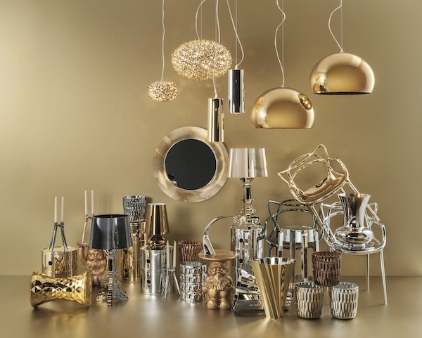
Replacing the cool blues and greens of recent years, a warmer spectrum of pinks, reds and oranges is emerging, reflecting more positive global outlook. Great on its own, the colour also combines perfectly with pinks, neutrals, white and other orange hues, as well as metallic colours such as gold.
Copper color reflects and complements all of the major trends that we have identified for 2015: a warmth in attitude and a renewed emphasis on sharing; the natural palette of the earth, from clay tones to sunlit highlights of yellow; the skintones that reflect human interaction and the sepia hues of the past. It is a colour of depth and currency that combines wonderfully with the everyday.
“We are learning to look at the world around us in new and unique ways,” added Heleen van Gent, Creative Director of AkzoNobel’s Global Aesthetic Center. “The overriding idea for 2015 is that people are finding new ways to add color to their lives and are developing a warmer and more caring environment for all.”
Text by Gabriele Masi.