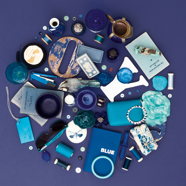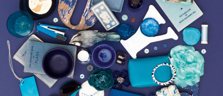
Don’t worry, it is not the last E. L. James’s novel, but the colour forecast by AkzoNobel’s Aesthetic Center suggesting Indigo blu as colour of the year 2013, inspired by the mood “Connections” of the ColourFutures.
To create wonderful colours, you need vision. As the largest colour manufacturer worldwide, AkzoNobel entrusts its Aesthetic Center to keep their fingers on the pulse of emerging social and economic trends, as well as the world of design, as these often signal the first signs of future colour movements. These insights are then translated into colour palettes and images, and captured in this annual inspiring edition of ColourFutures.
Indigo, the colour of the year for 2013 acts as a visual band-aid to our hectic lives. Indigo is a striking statement colour associated with wisdom and honesty which enhances your environment. Like the dreamy ocean landscapes hidden from everyone but deep sea divers, this colour gives us a sense of tranquillity and stability which is very restful. It’s a big and benevolent colour which combines the trustworthy nature and evocative elegance of robust blue. To understand the two sides of this indigo’s character, just think how we are reassured by blue uniforms worn by those in positions of trust and authority, but can still be dazzled by the facets of a sapphire. As a paint colour, this indigo adds a surprising, elegant strength. Indigo amazes us. Within a colour palette, this indigo is a versatile hue. It pairs very well with brights of a similar saturation level, citrus colours, or warmer neutrals, as well as other blues, purples and greens.
If you are asking why the Pantone color of the year 2013 il Emerald, the answer was giving by the colour designer Lia Luzzatto during the conference “Every Color is Green” organized by AkzoNobel last year in Milan. “The green consciousness has spread to become synonymous with environmental sustainability, to embrace the economy, manufacturing the tertiary sector to finance. – Luzzatto says- Recently the blue, a color symbolically linked to clean air and water is emerging on the social level: “Think Blue”, “Water is Life” and other similar slogans suggest that, next to the “green thinking” is developing a “blue thought”. The blue economy has thus joined the green economy and green, which for centuries had carved out a perceptual space, and a definite value metaphor, now begins to embrace the visual spectrum including blue, creating a new color that we call Blreen”.
Every year ColourFuturesTM presents one dominant influence or idea which inspired us to create the five colour trends. This idea influences each of the trends in a different way, but holds them together with a single concept and inspires the colour of the year. Last year the mood of the moment was ‘Possibilities’ and for 2013 we see communities and individuals embracing these possibilities and forming ‘Connections‘. Modern life is all about the ‘Connections’ we make and the way things interconnect to create networks, dialogue and innovation. Because of the speed in which we consume information, we also need to disconnect every now and then. It’s not just about social media, apps and gadgets, it is also about the way these technologies influence our state of mind and our need for understanding.
Download the pdf version of AkzoNobel’s ColourFutures 2013 and enjoy the amazing five Blue Connections (Collective Passion, Switchin Off, The Art of Understanding, Home Factory, Visual Solace).