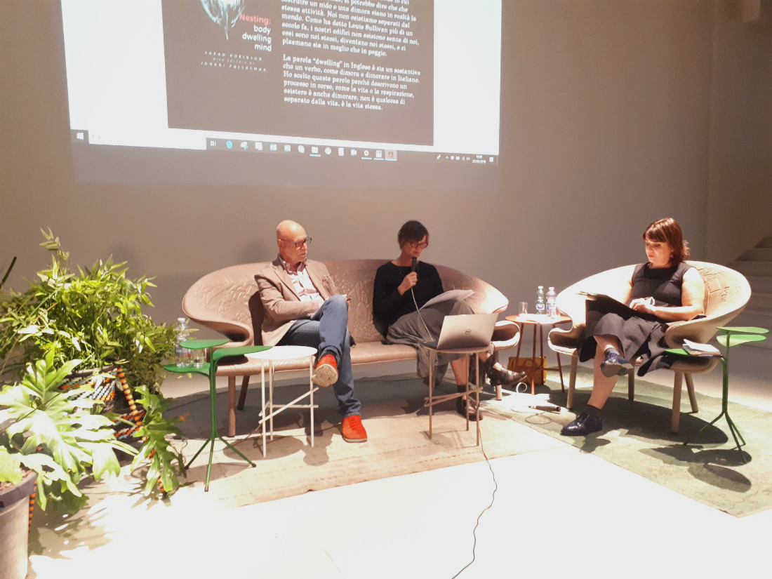
“There is no such thing as a suitable or not suitable colour in general, but a colour in a context. When we talk about colour we have to consider both the characteristics we can measure with our instruments and the humanistic side which is not quantifiable”: this is the core of lecture of Aldo Bottoli, founder of B&B Color Design and member of the Associazione Italiana Colore’s executive board, at the conference “The colour in neuroscience” organized by Moroso at their showroom in Milan, together with Sara Robinson.
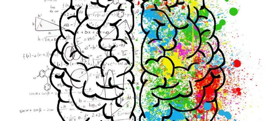
“There is something before the eye and something else after it: the world outside is made by measurable matter, inside we live an experience which is not quantifiable”. Neurosciences, has Aldo Bottoli said in the first of the Moroso’s conferences “The three bodies of colour: inspirations and visions” at the showroom in Milan, give us a wide range of instruments and knowledge to rethink the use of colours and other architectonical elements in the space. Starting from the question “how can we design the chromatic variability in the office?”, the B&B Color Design’s founder has summed up the most interesting hints.
What this the goal of a design project?
Our goal is to create a responsive environment both to our instinctual perception and to our emotional and cognitive ones. We have to distinguish what talks to everyone and what is significant just for someone.
We have learnt how to measure the matter around us, but, on the other hand, we have to give substance to our cultural and emotional part. We need a Copernican revolution: the man and his gestures and movement must be the core around which we build the envelope.
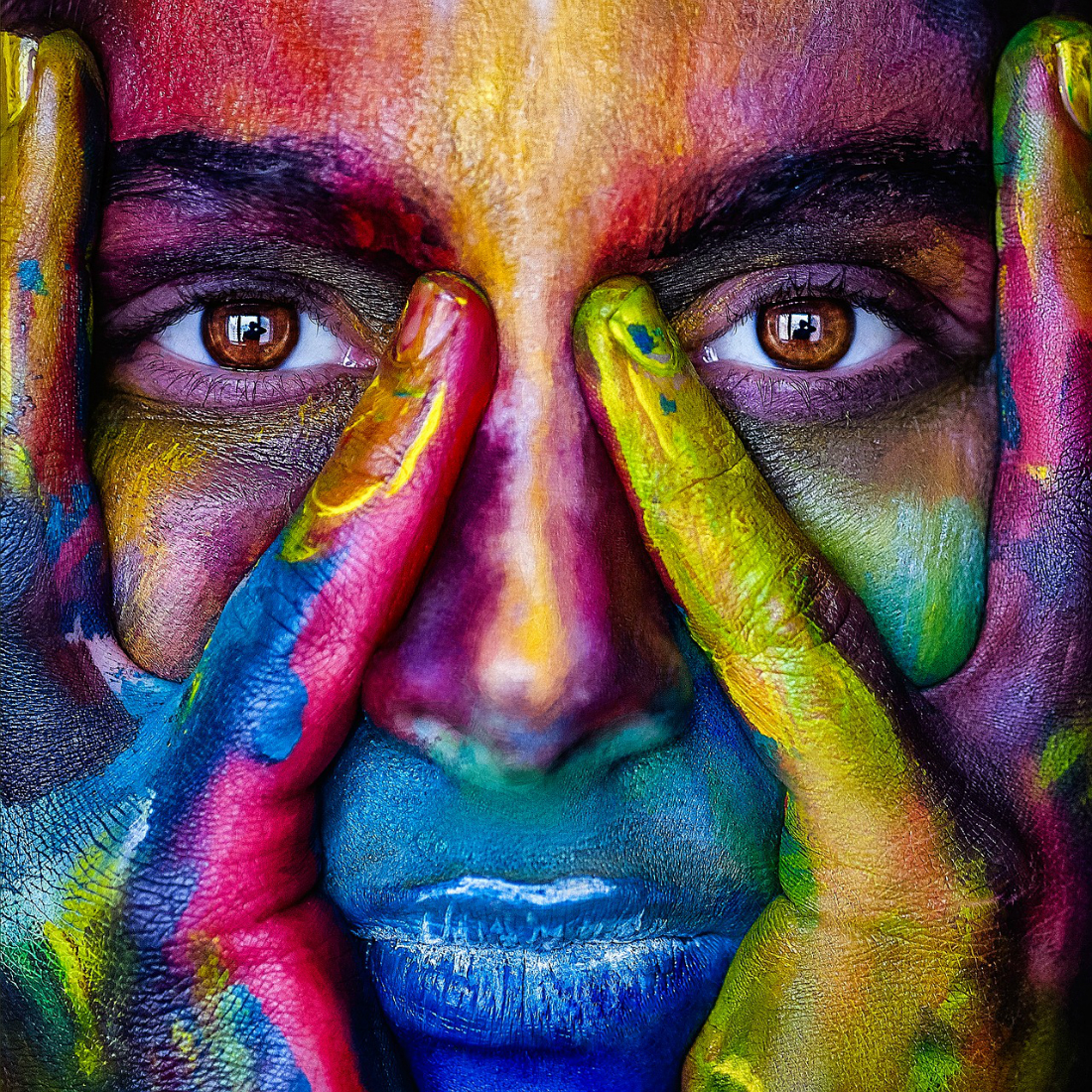
Neurosciences show u show colour is important for our perception.
Every single human behaviour comes from the natural environment, therefore we need to consider nature as our starting point: we have to recreate the variability of temperature, sounds, perfumes and lights. We need to bring the variability in the artificial, in order to make space perfectly fit our visual-perceptive system developed by our ancestors into the wild.
When we experience the world all our sense are simultaneously involved: our eyes literally touch and tastes the surfaces and the colour of things: anything can be seen as soft, rough, scented, disgusting…

Also, our personal experience plays a fundamental role.
Is the colour red beautiful? We can’t answer this question if we don’t consider all the scene.
What we have lived is critical to our experience of the space, therefore designing a space, I have to work on the variability, considering that the colour I choose can have a different meaning for another person. As in perfume, we need to add a “fragrance” that you can’t find in everyday life, that doesn’t involve an emotional response arising from the past.
Eventually, how do nature and culture influence our experience of the colour?
We always and simultaneously are natural and cultural: colour is a complex phenomenon because imply this duality. It is physical because is made by photons, but the meaning of it is expressed culturally and emotionally.
There is always a difference between what is seen and what is perceived, and also between what comes from our society’s aesthetics and what comes from contingency.
In general, the meaning is more important than the wavelength: we say “white wine” even though it is not white, or “green wood” even though it is not green. There is never a complete correspondence between the way we think the colour and the spectrophotometer.
Testo di Gabriele Masi.